We are proud to announce the launch of our new brand identity and look!

We are thrilled to unveil the debut of our fresh brand identity and appearance!
Exciting news! With immense joy, we share the launch of our new ASAC company logo, marking a pivotal step in our ongoing brand evolution. This encompasses a comprehensive transformation, featuring a new logo, color schemes, and typography.
ASAC has journeyed through growth and evolution over the years, prompting us to recognize the need for a rebranding initiative. Our logo has been reimagined to mirror both our present identity and our future aspirations. Delving into our organizational values, we meticulously crafted a brand identity that authentically communicates these principles.
After careful evaluation, we proudly present a brand-new logo, exuding a modern aesthetic and encapsulating our mission to foster holistic growth while contributing to a better future for society and the next generation. In our quest to maintain consistency with our original logo and propel the brand forward, we’ve fashioned a new identity that distinctly echoes our profession and core beliefs.
Our primary goal was to ensure the logo remains identifiable and memorable. Achieving this objective involved a meticulous reworking of the existing logo, considering its fundamental shapes, angles, and colors.
At ASAC, we hold diversity and inclusion in high regard, prioritizing our clients above all else. Our unwavering commitment to providing the best services stems from the diversity of our clients. It takes a collaborative team effort to deliver high-quality solutions, and we take pride in fostering such teamwork.
Here’s a glimpse into the symbolism behind our logo:
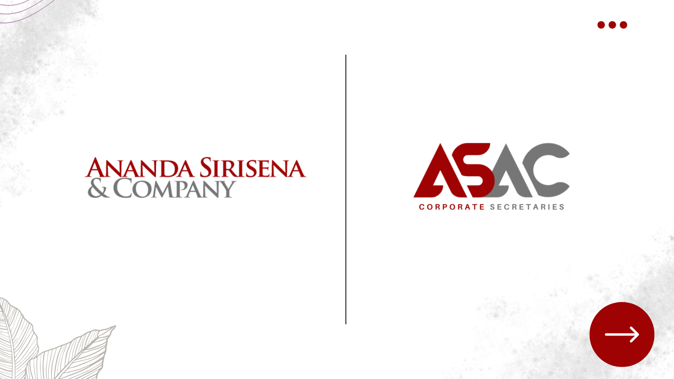
Dark Red:
- Continuous Bond: Symbolizing a robust and enduring connection, the dark red conveys the interconnectedness and commitment shared between our organization, clients, regulators, and stakeholders.
- Force, Depth, and Passion: This intense color reflects our determination, profound understanding, and emotional commitment to our clients and stakeholders.
Grey:
- Corporate Governance: Grey signifies professionalism and formality, representing our dedication to strong corporate governance practices and ethical standards.
- Professionalism: A classic and neutral color, grey conveys a sense of seriousness and competence, underlining our reliability and proficiency.
- Dignity, Modesty, Stability: Grey embodies dignity and modesty, signaling our commitment to long-term sustainability and a steadfast, reliable presence in the industry.
In summary, our logo serves as a visual embodiment of our values and commitments, with the dark red and grey colors delivering a powerful message of enduring relationships, professionalism, corporate governance, stability, and passion.
Over the next few months, we will be gradually updating all our collateral and business materials with the new logo. We appreciate your understanding as this process unfolds. For any inquiries, please feel free to contact us at www.anandasirisena.lk. Thank you for your consideration!
Established in 1991 by the late Mr. S. Ananda Sirisena, Ananda Sirisena & Co., (ASAC), is a leading Company Secretary practice in Sri Lanka. Specializing in Company Registration, Secretarial Functions, Intellectual Property, and Corporate Legal advice, ASAC expanded its services by becoming a Limited Liability Company in 2008. Through a strategic alliance with Double Entry Associate (Chartered Accountants), ASAC also provides Accounting, Taxation, and Audit and Assurance services. With decades of experience, ASAC is a trusted name known for its professionalism and commitment to excellence in the corporate sector.